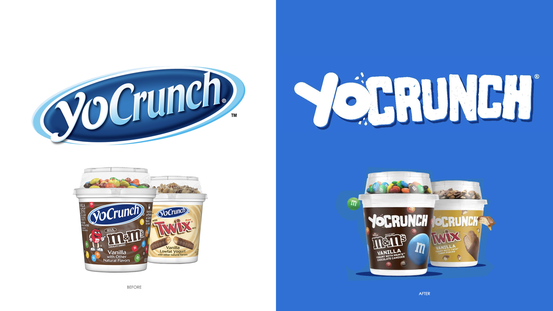
YoCrunch Packaging Refresh
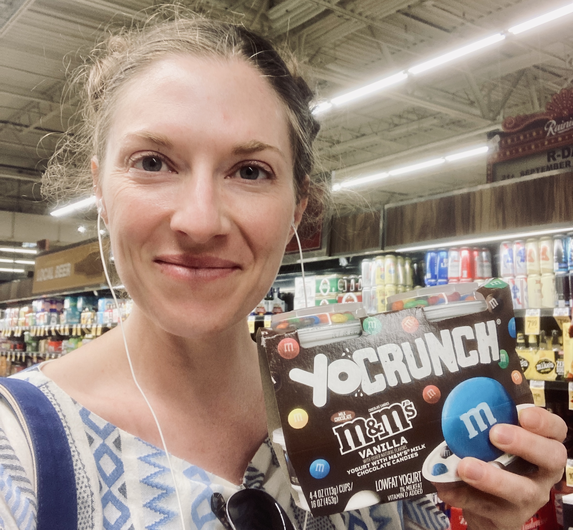
You know YoCrunch. Even if you don’t think you do, you do. It’s the original “only in the cool kids’ fridges” yogurt—the one with all those sweet, crunchy toppings tucked into the lid. What you do with the goodies is up to you. Maybe you dump them in, stir and enjoy like a grown-up. Maybe you wait until your last bite of yogurt and make it THICK with your entire topping reserve like a 10-year-0ld. Or maybe you just eat the smooth, creamy yogurt and do a shot of toppings afterward like a kid who just got to college and realized they can eat whatever they want. Regardless, this legendary brand’s look and feel was stuck in the past, and I got to help give it glow up with the talented team at Danone.
The Deets
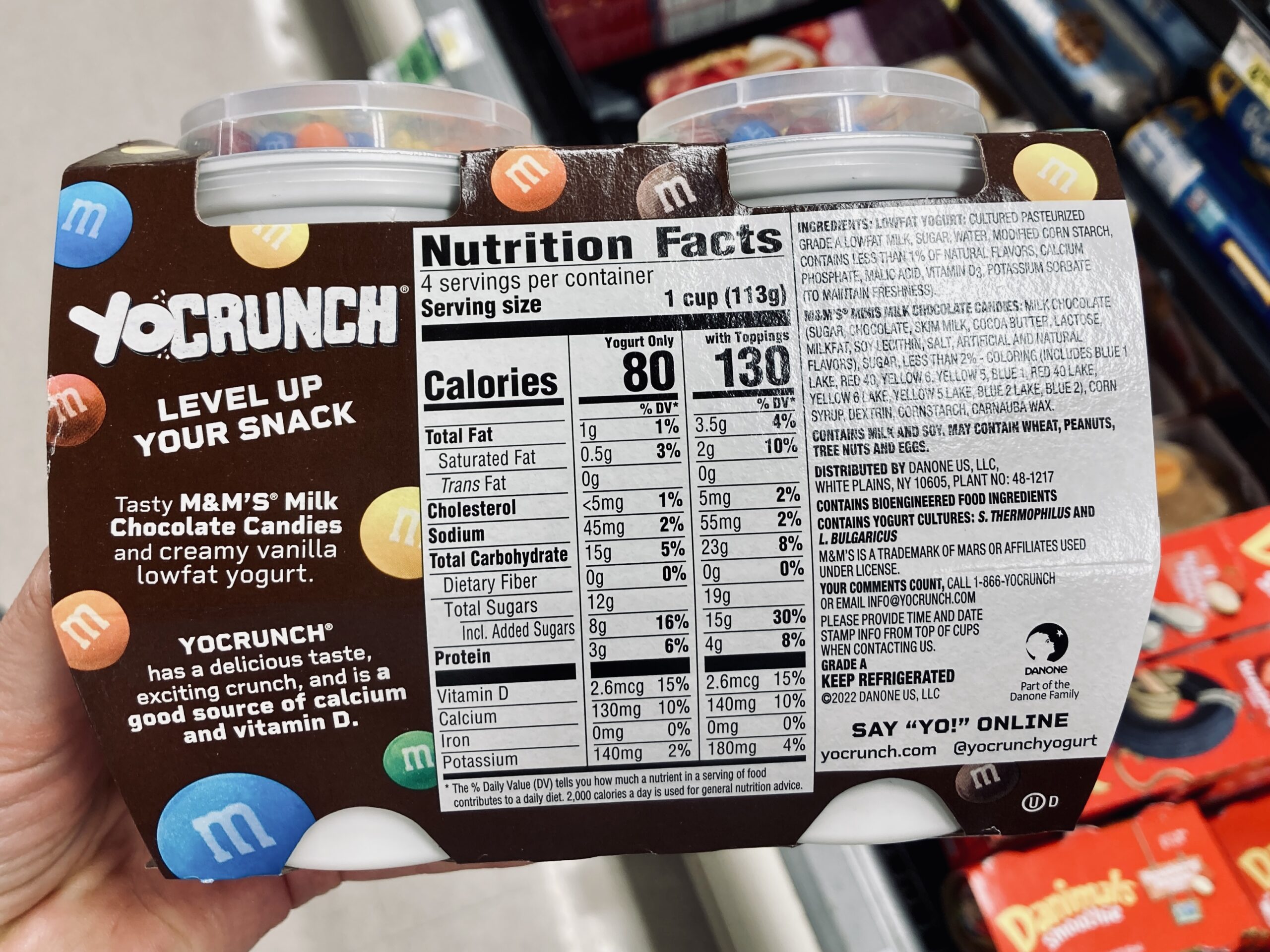
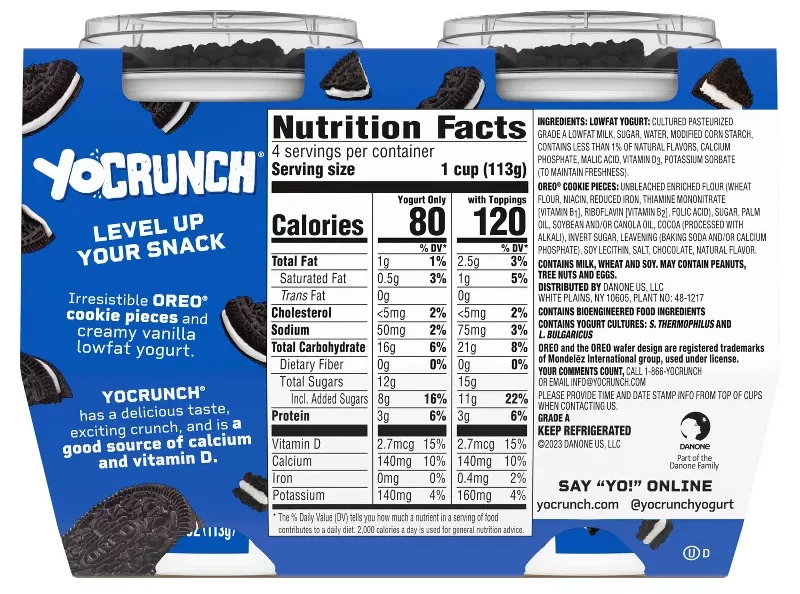
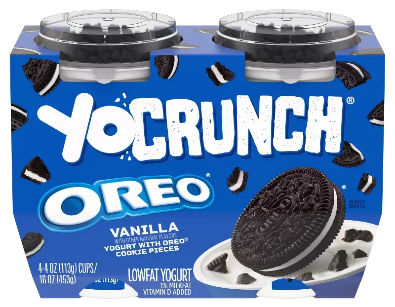
It was time for YoCrunch to look like it tastes: like a total boss baddie. The design team shook things up a flavor-quaking design that celebrates our brand name and gotta-have-’em toppings. And the tone? Loud, proud, punchy and impactful. We want yogurt lovers to feel empowered to throw M&Ms in life’s face any time it’s got you down. So, we ditched the cheesy checkmarks that used to grace the back of pack in favor of an uplifting headline (LEVEL UP YOUR SNACK) and short, descriptive copy.
Brand World
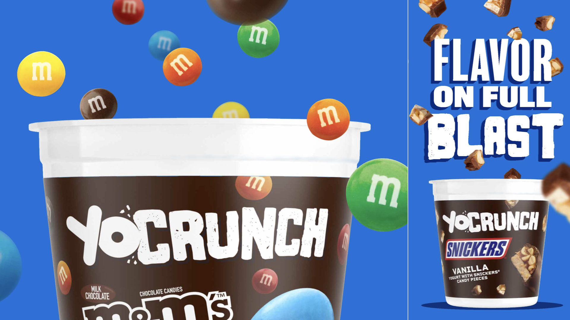
Once the packaging was locked in, I got to write a bunch of headlines to help bring the new YoCrunch to life online and IRL. From FLAVOR ON FULL BLAST to the samples below, I had debatably too much fun doing my job. Thank you to the Danone team for having me on the project. It’s a joy seeing our work every time I’m in the yogurt aisle.
PARTY ON THE TOP. BUSINESS ON THE BOTTOM.
YOGURT BE LIKE MAKE IT RAIN.
IF “EVERYTHING IN MODERATION,” THEN HOW COME THIS?
NOTHING ROCKS A YOGURT LIKE THAT CRUNCH.
YOGURT AND CANDY ARE OFFICIALLY AN ITEM.