Light + Fit Redesign
Eating better means feeling better. That’s not just common sense. It’s scientific fact. And it’s why Dannon Light + Fit has your back (and front and sides) covered with nourishing foods and flavors that lighten life up and help you find your fit. So, don’t be shy. Open wide and ADD SOME LIGHT.™
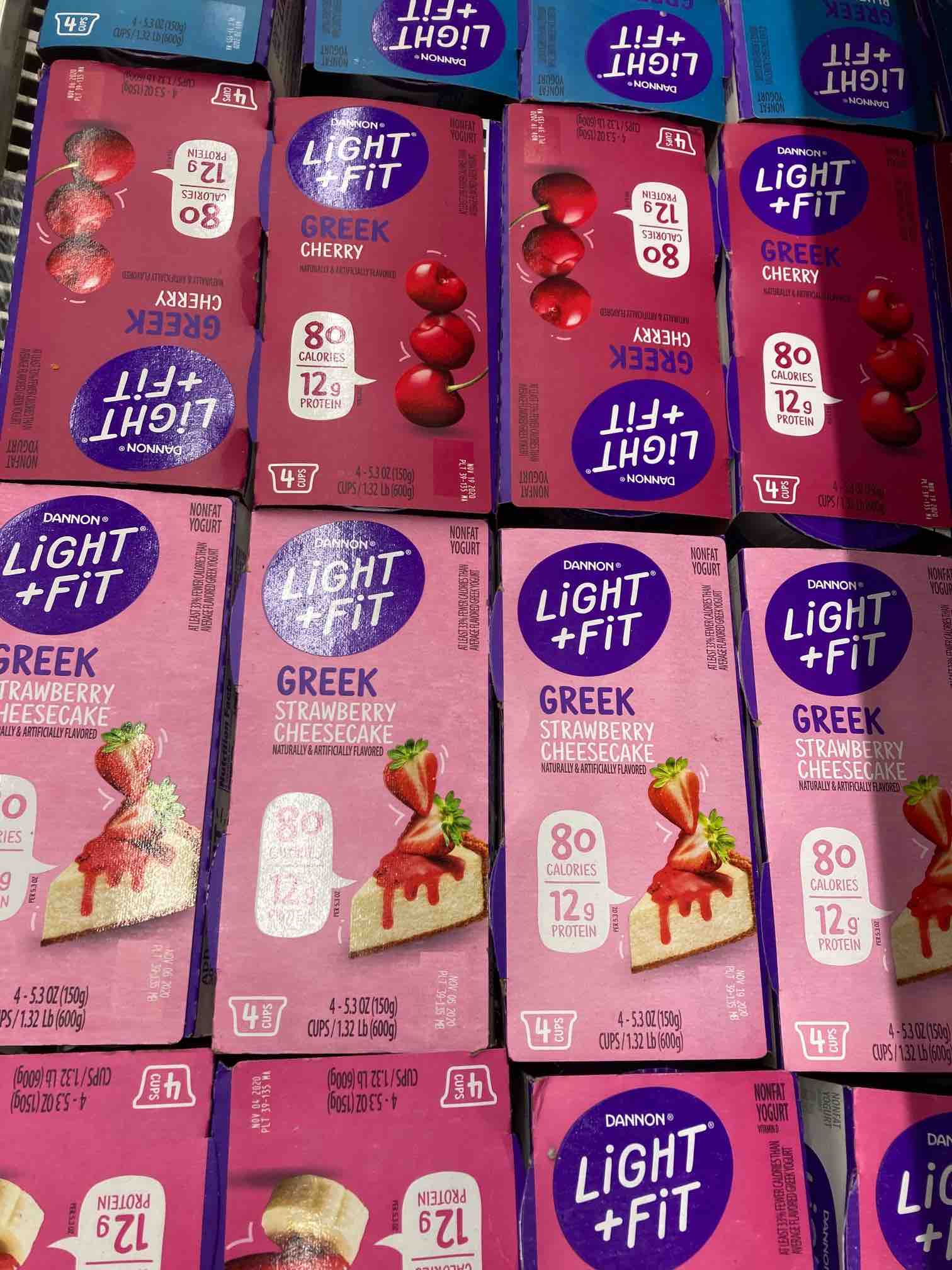
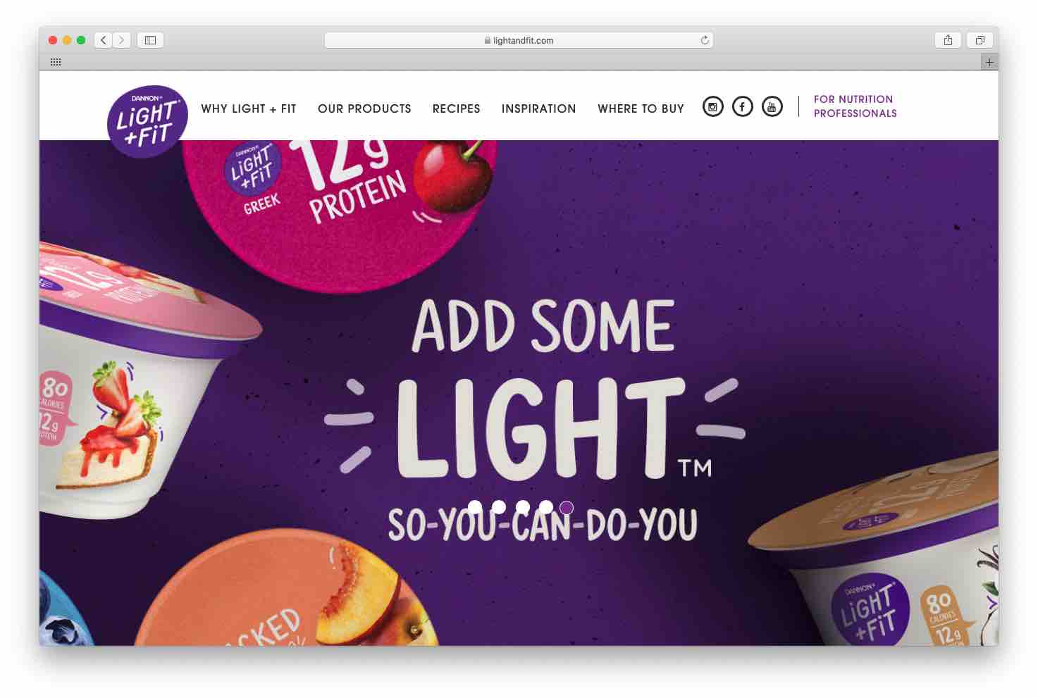
Same cool taste. Hot new look.
This new brand position and full packaging redesign comes to you courtesy of the yogurt-yumming masterminds at Light + Fit. I’m pleased as a peach to have been hired by the Danone North America team to help with crafting the copy that appears on all new cups and 4-packs of the brand’s regular and Greek style yogurts. I snapped some pics below to show a before-and-after comparison of the copy evolution from fully functional to emotional and empowering.
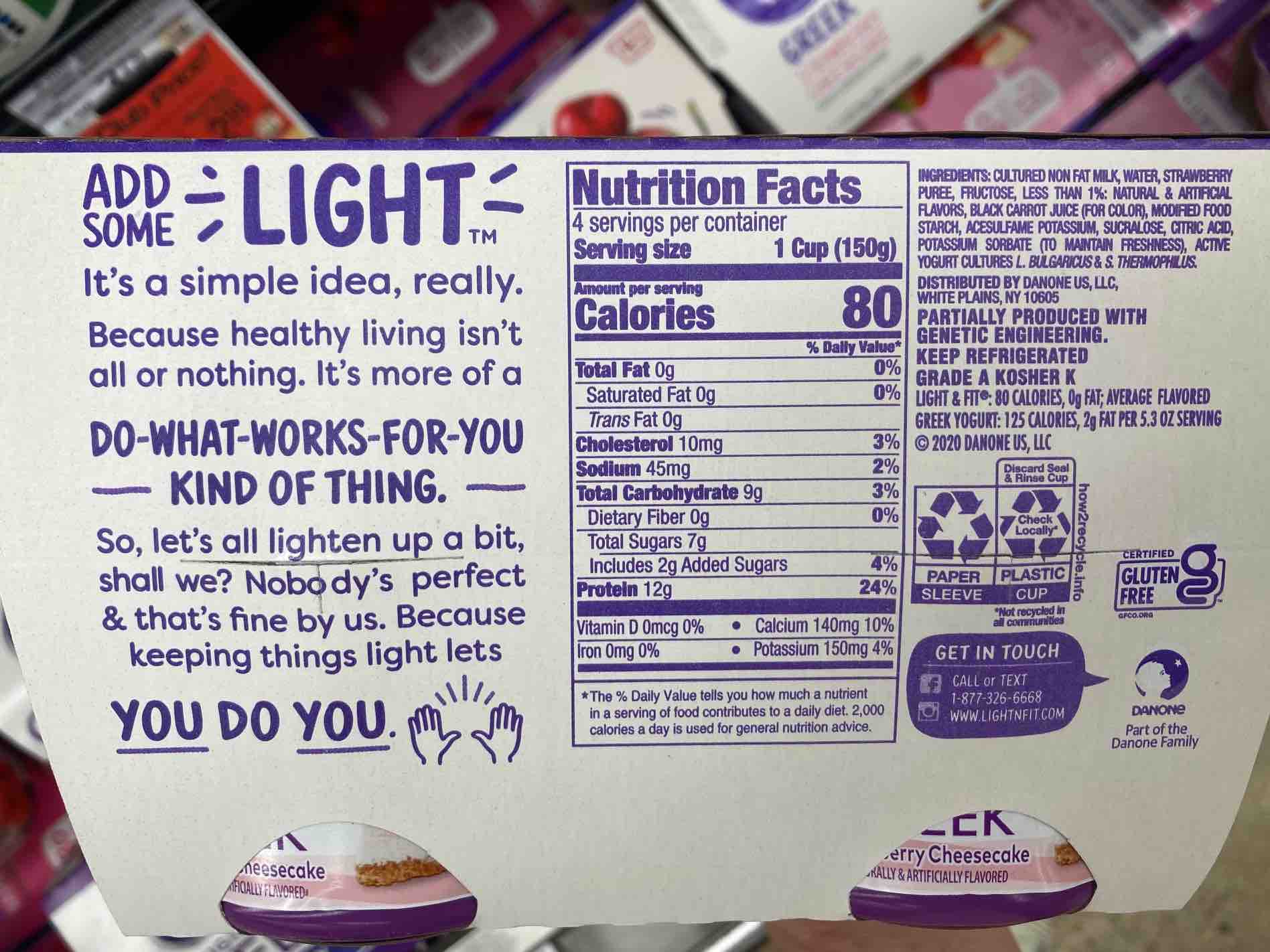
NEW BACK-OF-PACK COPY:
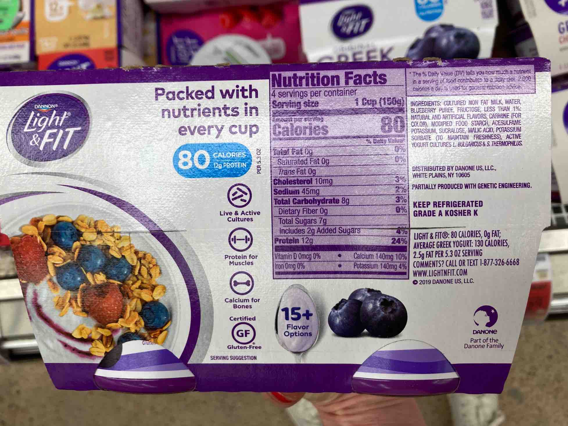
OLD BACK-OF-PACK COPY:
A “Fit” Facelift
The Danone design team crushed it on this one. Bright colors and playful hand-drawn emojis bring the new tone and positioning to life on-pack and online. Light + Fit’s call to “Add Some Light” is a challenge to society’s rules that eating healthy looks the same for everyone. This encouraging and uplifting brand is here to help people ditch the diehard rules and add some lightness to wellness with positive nutrition that satisfies their cravings like mmm. Because “light” isn’t part of “delightful” by accident. 😉
Get your spoons on some of this.
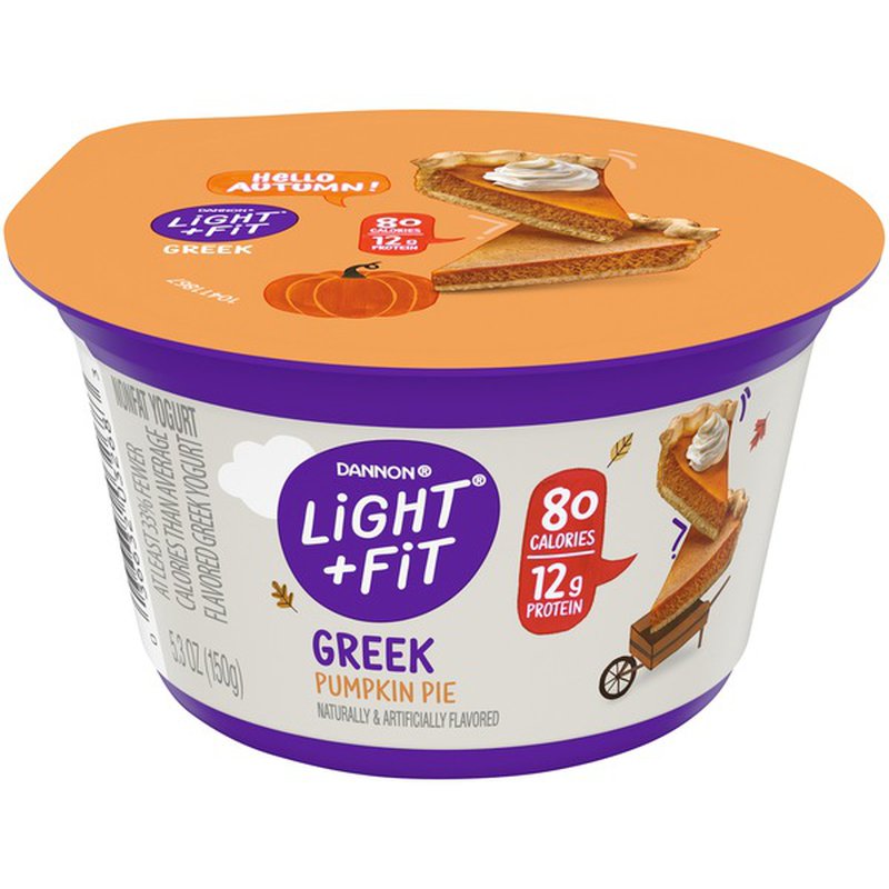
Look for the gorgeous new designs in your grocer’s dairy cooler and enjoy all the deliciously creamy flavors for yourself. Seasonal SKUs are on-shelf too, and the winter ones are absolutely to LIVE for. Pumpkin pie, anyone?