From Maple Grove to Kitchen Table
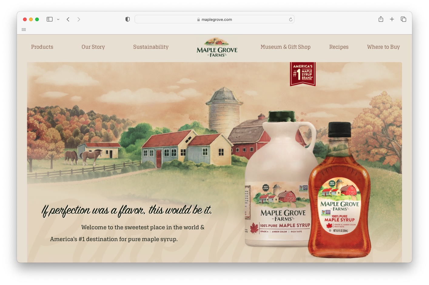
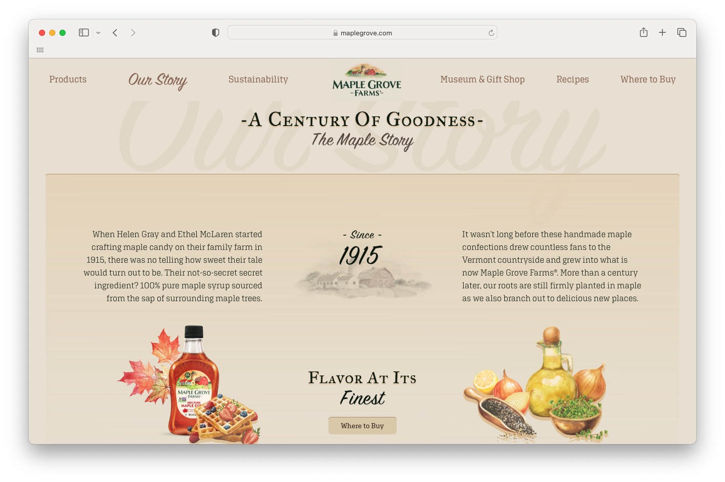
America’s #1 maple syrup has put in more than 100 years to earn its top rank, and Maple Grove Farms’ new website gives it the undeniable, unrivaled, uninterrupted screen time it deserves. Check out the fresh face (and copy, of course) of maplegrove.com to see this sustainability-focused brand in all its amber-glowing glory.

From On-Shelf to Online
Having previously worked with the B&G Foods team on Maple Grove Farms’ tagline and packaging refresh, I was all too happy to dive in on this delicious digital venture. The old website was outdated and left much to be desired, so we brainstormed, we collaborated, and we ate a lot of waffles and pancakes to achieve the masterful maple update you see live today.
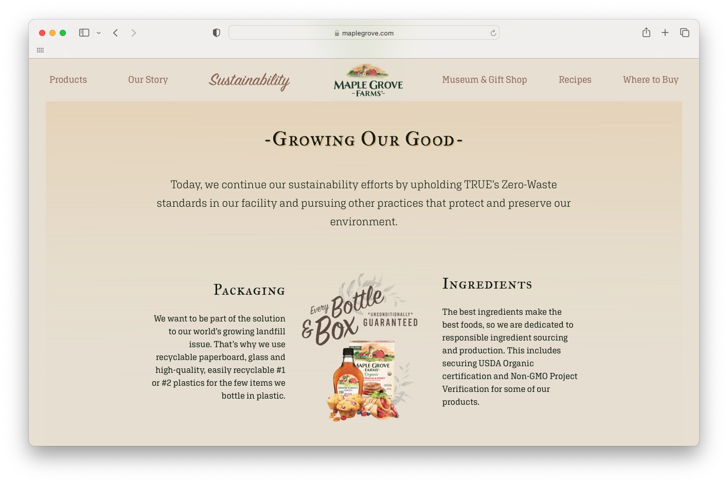
We strived bring the Farms’ rich story and commitment to sustainability to the forefront through polished, passionate copy and warm, inviting design. Until now, the brand communicated little about their planet-friendly initiatives and Zero Waste Landfill Project, which felt like a big miss. So, we created a new primary page dedicated to sustainability.
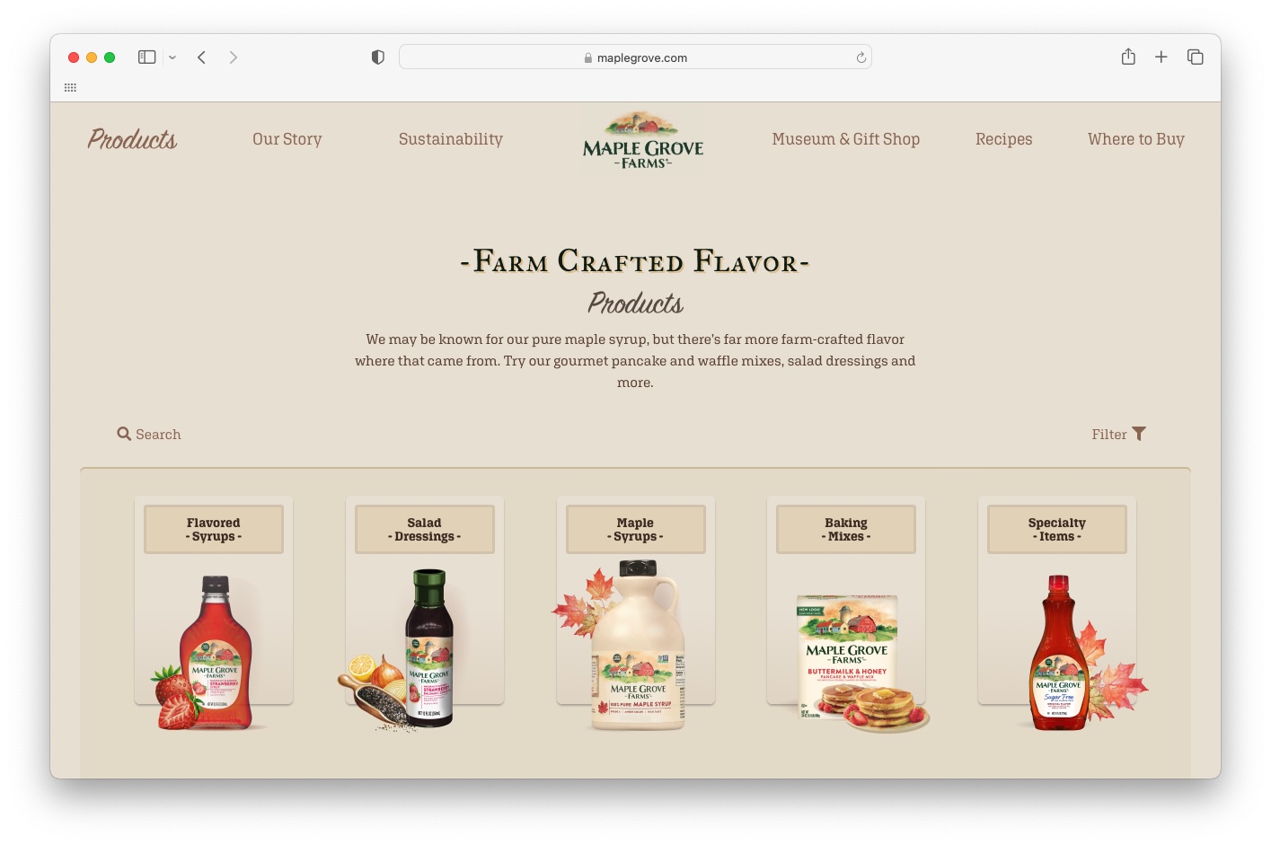
We also made all the products easier to explore and find in stores, showcased exclusive recipes, and created a new virtual destination for the Maple Grove Museum and Gift Shop located at the actual Vermont Farm (visitors welcome!).

Talking Pretty
From a tone of voice perspective, we kept things simple. Real. Honest. Not too country and not too crisp. Lines like “Our pure maple syrup is made with one simple ingredient, and our standards rise higher than even the tallest maple tree.” and “Bring the Grove Home.” capture it best. Check out the full site to read all the copy written by yours truly. Bonus: I also did the content strategy for the site.

Ooey-Gooey Gratitude
Thank you to Shahreen and the entire Maple Grove Farms team for having me on this tasty project. It was a pretty sweet and not-at-all sticky experience, and I look forward to working with you on this category-leading brand again very soon.
