A Fresh Website for Fresh Thymes.
I have a feeling I’ll be shooting off a lot of before and after blogs in the next few months, so ya’ll better settle in. Fresh Thymes gets the first one, and it’s extra special because I had a heavy hand in both versions.
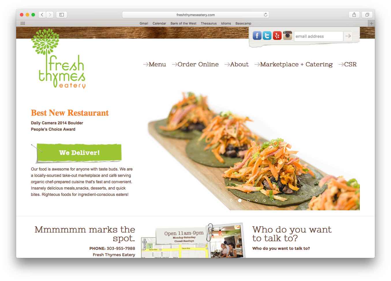
After being in business for several years, Fresh Thymes’ website had gone through several evolutions to fit the restaurant’s growing needs. But when owner and chef Christine Ruch decided to open a second location (the carry-out Fresh Thymes Marketplace), she rang me up to request a full website refresh. It made sense because the old site structure was starting to feel pretty pieced together. We need a cohesive, modern update, and we needed it NOW.
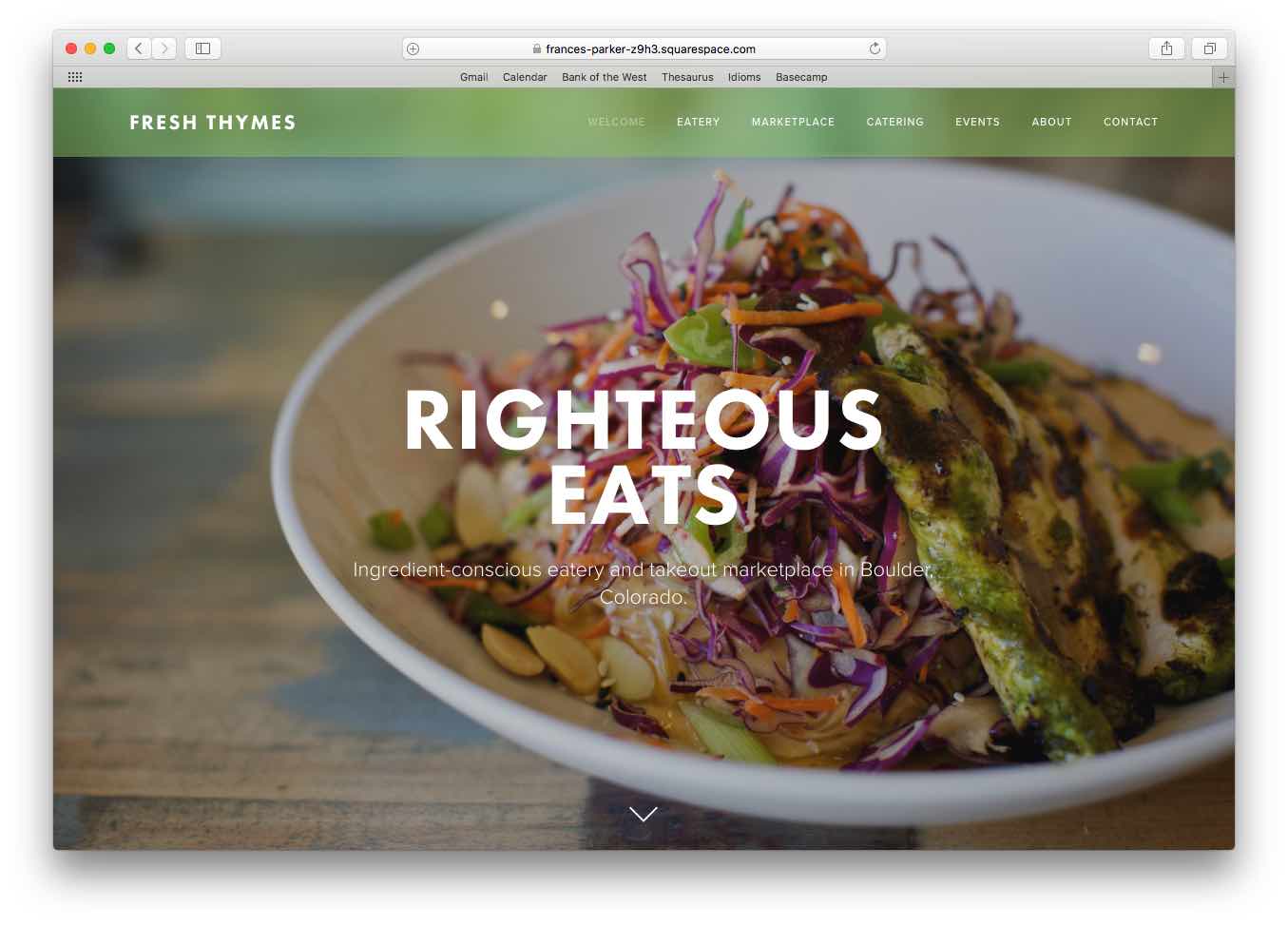
I wrote some bold and righteous copy and worked with Christine to choose a template in SquareSpace so she would be able to easily update the site herself. From there, Frances Parker Studio beautifully brought it all together to create a bomb website that represents Fresh Thymes as a whole (the Eatery, the Marketplace, the catering, the food, the fun, the philosophy…the everything).
THE AFTER (pretty slick, right?):
 THE BEFORE (still cute, but needed a refresh):
 A brand new website on New Years Day. How do you like that? I like it a lot, and I’d venture to say that Boulder’s conscious eaters are going to feel the same way.