A Modern Look for Ancient Harvest
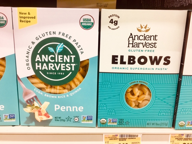
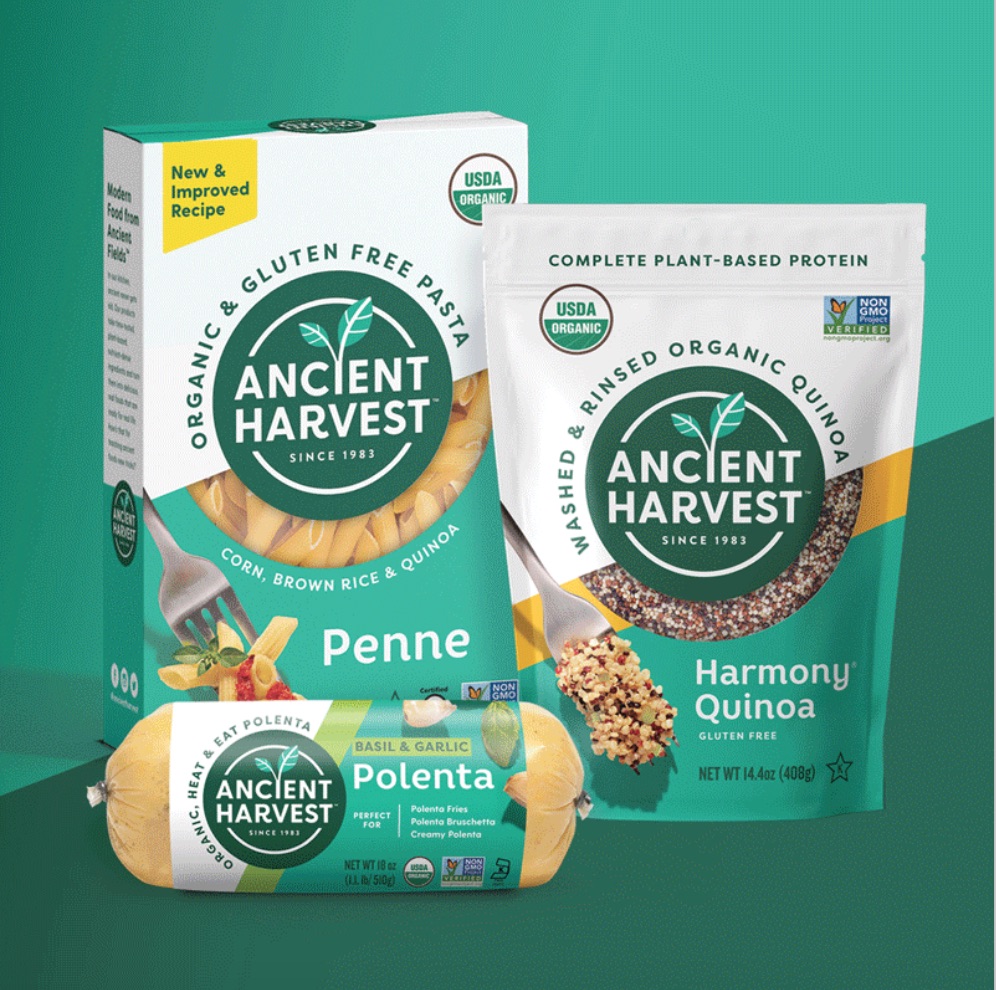
While I can’t take credit for the copywriting on this bad boy, I was thrilled to get the chance to work with Ancient Harvest and Faven Creative on the positioning and tone of voice development for their recent rebranding effort. This gorgeous new packaging (new on the left, old on the right) was set to launch at this year’s Expo West, but due to the event’s postponement, I wanted to give the project some love here on mi’blog.

Alicia Potter of Faven did an incredible job bringing modernity and movement to the stale and stagnant (sorry, but it was) former design. The “hero badge” as we call it brings focus to the brand name and logo with plant-based awesomeness sprouting from within. The unique window shapes are purposefully and beautifully integrated into the design to draw your eyes’ attention and make your mouth water.

I was bummed that scheduling kept me from getting my hands on the copy, but I tip my hat to the team on the final product. Well done, and may these delightful ancient ingredients never get old.
(Image credit: Alicia Potter LinkedIn)